
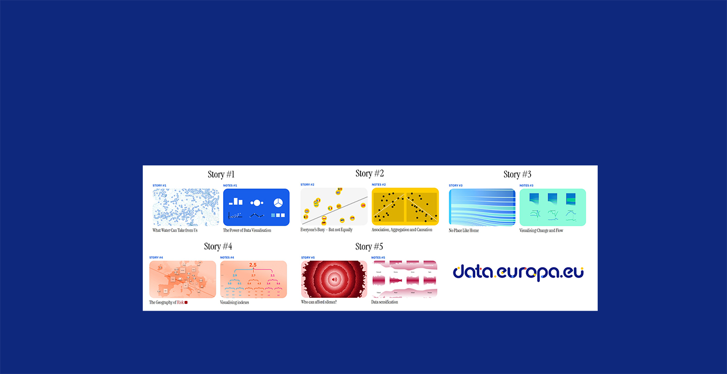

All countries within the European Union (EU) are required to generate special high-value data sets and to make them publicly available under the official portal for European data: data.europa.eu. These data sets include things like level of risk, such as poverty, inequality, unemployment, etc. In order to make the data more approachable, the EU looked to IDSC Visualization program director, Dr. Alberto Cairo.
 With a career that “tracked alongside the major technological developments in and out of the newsroom” Dr. Cairo was described in a Microsoft / Story Labs profile profile as having spent “his entire career in the vanguard of visual journalism.” A renowned visualization designer and art director with many years of experience leading graphics and visualization teams, Cairo was approached to art direct a series of stories highlighting five of these EU high-value data sets.
Cairo and his team were tasked with creating a narrative that could serve as an example of what can be done with the data sets in order to inform discussions about issues of public interest. Each narrative or “Story” was also paired with visualization “Notes”— a second, more theoretical article designed to introduce the reader to the language of visualization and to illuminate the methods utilized.
Working as art director in cooperation with the EU Publications Office, Cairo led a team that included Brazilian co-designer Rodolfo Almeida, and Mexican computer scientist, mathematician, and coder Gilberto Leon who did the development and coding of the interactions. The project took a little over a year to complete. Story 1 was published in November 2024, and the series was finally complete with Story 5, published in October 2025. Beyond giving visibility to the data, Cairo conveyed, he hoped the Stories would inspire journalists, decisionmakers, etc., to imagine what other creative projects can be done with high-value data sets, and that Notes would help with the how. [ Below is a summation, but please click through for the full interactive experience at data.europa.eu! ]
Understanding the EU through High-Value Datasets: Highlights from the interactive data story series
Story 1 + Notes 1
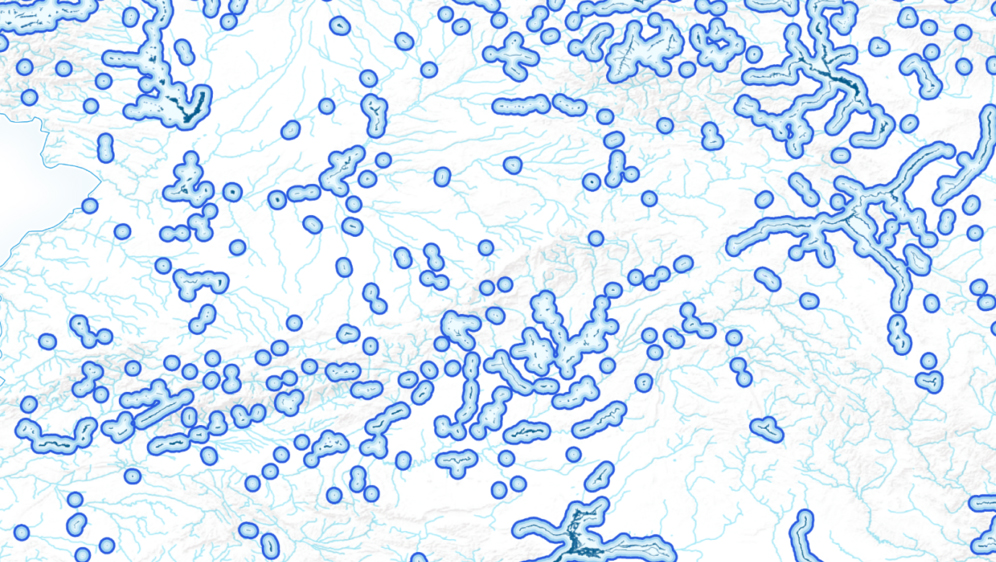
Published in November 2024 (following the catastrophic flooding, particularly in the region of Valencia, Spain), Story 1 “What Water Can Take From Us: Visualizing flooding risk in Spain through high-value datasets“ looked at the entire country of Spain, visualizing regional fluvial flooding. After scrolling through a series of maps depicting the risk by region, the story engaged the reader by allowing them to enter their location (worldwide) thereby giving some frame of reference to the magnitude of flooding and making it relatable by placing the scale within a familiar context.
The accompanying Notes 1 “The Power of Data Visualization: How visualization allows us to reason through data“ introduced the reader to the power of visualization—the art of representing data through different type of charts (such as bar graphs, line graphs, pie charts, or maps). The Notes covered basic vocabulary and explained how these visual tools help the reader detect patterns and trends that would not be apparent in a table.

Story 2 + Notes 2
Story 2 “Everyone’s Busy—But not Equally: Time expenditure and income equality through high-value datasets“ looks at how Europeans (by country) use their time as correlated to income inequality, and allows the reader to compare themselves to the average of their (EU) country or other EU countries by age and gender. Results may surprise you as work and travel categories were, overall, much smaller than one would expect! Another interesting interactive feature shows the reader which country spends the most time on a selected activity. For example, on average Germans spend the most time shopping and Norwegians the least time sleeping.
The accompanying Notes 2 “Association, Aggregation, and Causation: Visualisations can be useful, but we shouldn’t read too much into them” explains scatter plots and how to read—and not misinterpret—data sets, touching on “ecological fallacies” (making inferences about an individual based on aggregate data for a group) and “correlation is not causation” (analyzing variables).

Story 3 + Notes 3
Story 3 “No Place Like Home: Exploring travel preferences within the European Union through high-value datasets“ explores travel preferences within the European Union. It presents an example of how high-value tourism datasets can be visualized to reveal trends over time, such as the impact of the COVID-19 pandemic on travel within and between EU Member States. The header image shows that 90% of the French vacationed in their own country (between 2012 and 2023), indicating the concentration by destination.
Notes 3 “Visualising Change and Flow: To build a data-driven narrative, connect every step to its previous and following ones” emphasizes the importance of, when building a data-driven narrative, connecting every step to its previous and following ones. Cairo encourages data visualizers not to simply load the numbers into a software tool and let the program decide which type of chart to use. Also, he suggests, do not go with your first instinct. Rather, think of the chart that you are designing as a tool for understanding. What do you want readers to see in your chart? What is its intended goal? And make your choice of charts, graphs, or maps based on the answers to those questions.
Story 4 + Notes 4

Story 4 “The Geography of Risk: Exploring the risk of humanitarian and natural hazards through high-value data sets“ presents an example of how risk datasets may, or not, be correlated to high-value sociodemographic datasets, allowing the reader to explore their relationship in an interactive manner. European countries rank low on the INFORM Risk Index in comparison to the rest of the world, but that doesn’t mean that risk is non-existent. Using the European Commission’s Inter-Agency Standing Committee Reference Group on Risk, Early Warning, and Preparedness or “INFORM” Risk Index (among other datasets), this project rendered an interactive scatter plot that reveals the probability of facing a natural disaster or humanitarian crisis depending on where you live (globally).
Notes 4 “Visualizing Indexes: From individual observations to high-level indicators“ The INFORM Risk Index weighs more than 50 variables grouped into three dimensions. First, the probability of humanitarian crises or hazards; second, the vulnerability of people in each country; and third, how prepared (or not) a country is to cope with a crisis. In other words, this index weighs the risk of occurrence of catastrophes (risk of what, and where), the risk dependent on the living conditions of people on each country (risk to whom) and the relative strength or weakness of each country’s institutions. Each of these three dimensions is weighed equally to come up with a single number that spans from 0 (very low risk) to 10 (very high risk). These Notes explain, with Italy as an example, how in the diagram’s third and fourth levels Italy’s risk of earthquakes and coastal floods is moderate to high, but this is mitigated, for instance, by low socio-economic vulnerability and by governmental institutions that are prepared to cope with hazards. This illustrates how, as is often the case with charts and statistics, a single figure may not tell the entire story!
Story 5 + Notes 5
Story 5 “Who can afford Silence? Listen to the unequal distribution of noise complaints through high-value datasets” From sprawling urban centers to small rural villages, it may seem like silent environments are scarcer than ever. A 2020 study from the European Environment Agency claimed one in five Europeans were being exposed to harmful levels of noise pollution, which, besides being a general annoyance, was linked to cardiovascular and metabolic issues and sleep disturbances. One of the key objectives of the EU’s zero pollution action plan is to reduce noise. To achieve that goal, we need to understand how this data is currently distributed. Who gets to enjoy silence and who is forced to regularly endure noise within each Member State? We can get a glimpse of this data from the percentage of people reporting noise from neighbors or from the street each year. The graphic depicted the results proportionately as well as with a a sample sound wave allowing the reader to hear the difference between relatively quiet countries and countries where noise is considered a problem.
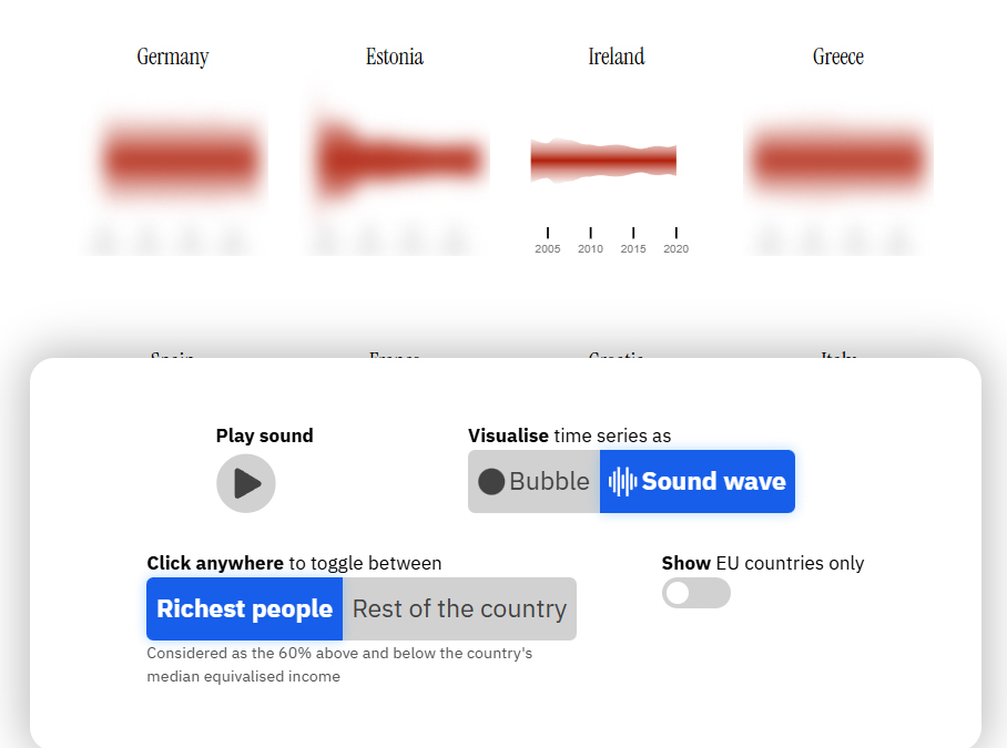
Notes 5 “Data sensification: Data visualisation is just one of the the many ways to encode and communicate data” The fifth story in the series was an experiment inspired by a few questions: what if visualisation doesn’t always consist of communicating insights from data clearly? What if visualisation could be used for other purposes, such as artistic expression? And what if visualisation isn’t the only way to encode data? Vision is just one of our senses. It’s a very powerful one, and that’s why data visualisation is so useful for understanding data, reflecting on it and building stories based on it. But what about our other senses? Why not experiment with data physicalisation, data smellification or, data sonification? And what if we could transform visualisations into multimodal experiences, so a person can not only see the data, but also touch it or hear it at the same time?