
Amir Rodrigo Dukmak Garcia has spent most of his career managing and analyzing the copious streams of data produced by healthcare and IT companies from South Florida to Canada. He loves the process of sorting and cleaning up data to find the nuggets of truth hiding inside.
 But whenever it came time to share his findings with his colleagues, Garcia gave little thought to how he was presenting the data. He would use prebuilt PowerPoint templates or simply pass along graphics generated by spreadsheets. “I didn’t consider the audience at all,” he says with a laugh.
That changed when Garcia, 49, enrolled at the University of Miami to get a master’s degree in data science and his advisor urged him to take a data visualization class. By the end of the semester, Garcia had learned how to use Adobe Illustrator, Flourish, and other visualization tools, designed his own infographics, and gained an appreciation for the importance of presenting data in a way that readers can easily grasp.
“It doesn’t matter what medium you’re using, if you want the message to percolate, you better put it in a way where your audience is able to soak it up and understand it easier,” said Garcia, now an ETL (extract, transform, load) Developer for UM’s office of Development and Alumni Relations. “Now there’s a bunch of things I will take into consideration for my audience. Everything I know about data visualization right now is thanks to this course.”
The course—JMM 331/622: Introduction to Infographics and Data Visualization—is taught by Alberto Cairo, who holds a joint appointment as the Knight Chair in Visual Journalism at UM’s School of Communication and director of the UM Frost Institute for Data Science and Computing (IDSC) Visualization program. Cairo spent years as a journalist leading newspaper graphics departments from Spain to Brazil, serves as a visual design consultant for Microsoft, Google, and U.S. government agencies, and authored several books on data visualization.
“Pretty much like writing, visualization is not just a tool for communication, it’s a tool for reasoning.”
Cairo says there are two main lessons that his students (and his professional clients) should take from his teachings. The first is that data, and whatever insights are gleaned from that data, remain trapped in the mind of the researcher unless the information can be conveyed in a way that others understand. The second lesson is that the researcher also benefits from making visuals and graphics because the process forces them to contemplate the theme, message, and lesson from the data.
“Pretty much like writing, visualization is not just a tool for communication, it’s a tool for reasoning,” he said. “By engaging with the information you’re presenting, you’re also reasoning and understanding that information better. This is what develops in their brain: not only a sense of how to better communicate and a sense of design, but also a sense of story structure and a more analytical sense of how to engage with information.”
 Michela Tjan Sakti Effendie was skeptical when she signed up for Cairo’s course in the fall. A three-time All-American golfer at Keiser University and the NAIA National Player of the Year in 2021, Effendie started getting interested in data science as she finished her bachelor’s degree in Marketing and Entrepreneurship. When she was accepted at the University of Miami for a master’s degree in data science, an adviser suggested she take Cairo’s course, which she assumed would be a repeat of the graphic design classes she had taken before where, “all you’re trying to do is make things pretty,” she said.
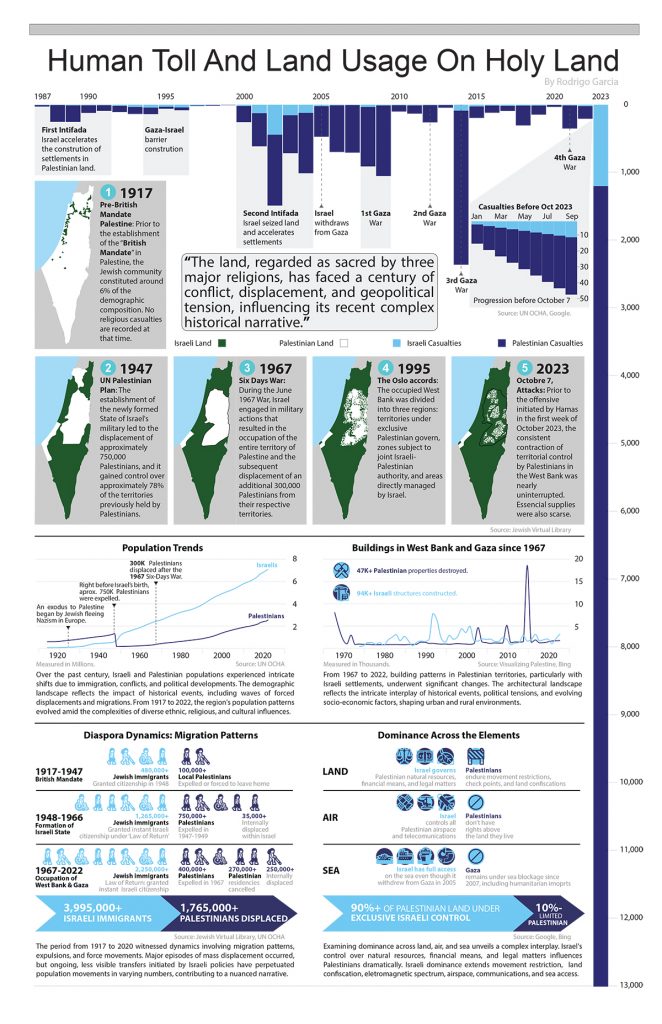
But Effendie quickly realized that Cairo’s class was different. She and her classmates were forced to think through their subjects, research them, identify the most relevant data points, and display everything in a way that made sense to readers, whether they know about the subject or not. Her final project focused on the earthquakes that constantly ravaged her native Indonesia, and Effendie said she ended up learning a great deal about the intensity and frequency of those earthquakes even though she had lived through so many of them as a child.
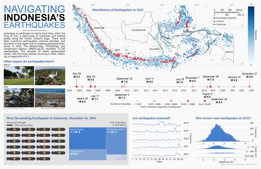
“With both graphic design and visualization, you have to lay everything out with a purpose,” she said. “Being able to have the graphics flow together to tell one story, having viewers be able to understand mostly from the graphics and not from the text, that was fun and challenging.”
Now Effendie regularly uses the lessons she learned during her side job doing web analytics for an Indonesian company. “That’s a big part of it, being able to present your findings,” she said. “All those insights are not going to stay in your laptop. We have to explain it.”
When he’s not teaching his class, Cairo spends a lot of time helping data scientists visualize and present their findings. But he stresses that the reasoning and presentation skills he teaches are transferable to just about any field, and the makeup of his classes reflects that.
“It is rare that a student ends up pursuing a career in data visualization, and that’s perfectly fine because the goal of the class is that they acquire the skills,” he said.
To learn more about Cairo’s class, visit his website.