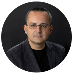
Alberto Cairo, a University of Miami expert on data visualization, has been encouraged by the data visualization techniques used by news organizations, researchers, and government agencies throughout the COVID-19 pandemic. Almost overnight, they started cranking out graphics, tables, charts, and interactive databases that showed Americans the number of infections, the location of hot spots, positivity rates, mortality rates, and the efficacy of vaccines.
 “I think the pandemic is, essentially,
going to become one of the landmarks
in the history of visualization.”
“I think the pandemic is essentially going to become one of the landmarks in the history of visualization,” he said. But Cairo said the pandemic also revealed a “gigantic knowledge gap” that exists in the United States as people misunderstood, or misrepresented, the data they were seeing. Cairo blames an educational system that fails to teach statistics properly in middle and high school, lumping statistics exclusively into mathematics classes when really, statistics should be treated more like reasoning and logic exercises.
He gave the example that some people focused almost exclusively on reports of a handful of the populace who suffered complications from the COVID-19 vaccine while ignoring the tens of millions of doses administered successfully. “What we need to teach people is not the formulas or how to do broad calculations, we need to teach how to reason with those tools, how to reason with science, and how to reason with numbers,” Cairo said. “And more importantly, how to reason about probability in an uncertain context, how to reason about risk.”
Cairo’s analysis is one example of the work he does at the University helping students, faculty, and others identify their most compelling data and present it in a way that allows consumers to understand it. The former digital journalist is the Director of the Visualization unit at the Institute for Data Science and Computing (IDSC) and the Knight Chair in Visual Journalism and Associate Professor in the School of Communication.
 “When Alberto talks, people listen.”
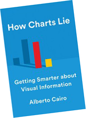
IDSC Deputy Director Ben Kirtman, an atmospheric sciences expert, said Cairo has helped him better understand which data to pull out of his studies and how best to present them in his research papers and press releases. “You should see my copy of How Charts Lie,’” Kirtman said, referring to a book Cairo published in 2019. “Almost every line is highlighted. He’s a true leader of IDSC. He’s infusing a lot of important ideas. It’s a little bit like those old E.F. Hutton commercials: ‘When Alberto talks, people listen.’”
 But Cairo’s work stretches far beyond Coral Gables. Over the past year, Cairo has advised private companies and government agencies on how to improve their data visualization techniques to enhance understanding of topics ranging from artificial intelligence to public health.
In June, he taught graphical communication skills to 20 members of Microsoft’s “AI for Good” unit, which is designed to help organizations that are focused on solving global challenges affecting the environment, health, and humanitarian issues. Cairo worked with a team of data scientists, coders, and designers to teach them how to process their information and present it in ways that illuminate and inform each of their target audiences.
In March, Cairo hosted a month-long series of training sessions for the World Bank’s Poverty and Equity unit. In that case, he trained more than 30 data scientists and economists who publish data that researchers, government agencies, and non-governmental organizations rely on to understand the current state of global poverty.
Cairo said he works only with organizations whose mission he supports. He continues consulting for Microsoft’s AI for Good unit and the World Bank’s Poverty and Equity unit because “I think the mission of those organizations is worthwhile, and they do a very important job.”
Cairo is currently finishing his fourth book: “The Art of Insight: How Great Visualization Designers Think.” [click to pre-order] Based on conversations with dozens of visualization designers, Cairo will introduce the best designers in the field and provide insights into the values and techniques they use to present data. “Who they are, what drives them, what drives them crazy,” he said.
In the Spring, Cairo expects to resume his roles at IDSC and the School of Communication fully. He will get back to teaching in-person classes on visualization, conducting workshops for UM students and outside organizations, helping IDSC scientists present their data, and organizing IDSC’s next Big Data Conference scheduled for January 2023. And in each case, he is excited that he can train not just journalists, but a wider range of students to ensure that data is presented more clearly across every field.
“Eighty percent of my students are not journalists,” he said. “They are data scientists, marine scientists, physicists, statisticians, and business analysts.”
Tags: Alberto Cairo, Ben Kirtman, COVID-19, Data Science, Data Science Education


