


Visualising Climate 2026 | Bologna, Italy • 4-6 November
 As a heat wave gripped Spain this summer, Alberto Cairo, PhD saw, in a series of temperature charts, a powerful example of what climate visualization can accomplish.
Created by climate scientist and data visualizer Dominic Royé, the charts show how far temperatures in Spain have departed from historical norms. They compare the country’s daily mean temperatures with a historical reference curve, using color to make periods above and below normal immediately visible. Royé also published a detailed explanation of how he created the charts, including his decisions about data sources, geographic coverage, historical baselines, and statistical smoothing.
“It’s not about just depicting the data.”
For Cairo, director of visualization at the University of Miami’s Frost Institute for Data Science and Computing (IDSC), charts like Royé’s demonstrate just how effectively visualization can convey what climate data means for people and the world around them.
“Once you see it visualized, that creates almost an emotional impact,” said Cairo, who also holds the Knight Chair in Visual Journalism and is a professor at the University of Miami’s School of Communication. “It’s not about just depicting the data. It’s about depicting what the data means—to your life, to my life, to the market, to the environment.”
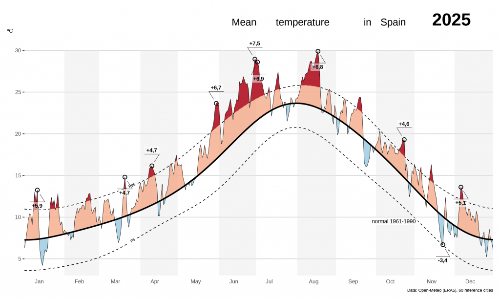
Climate and atmospheric data have grown increasingly abundant and complex, making them vulnerable to misrepresentation. A visualization can be technically accurate but still downplay uncertainty, blur the distinction between historical observations and future projections, or fail to show what the numbers mean for people’s lives.
Seeking ways to make climate change not only understandable but also visible, emotionally resonant, and practically meaningful, Cairo joined like-minded colleagues to create Visualising Climate 2026.
The first stand-alone conference devoted to the visual communication of climate and weather data has drawn an enthusiastic response from both prospective attendees and contributors.
Set for November in Bologna, Italy, Visualising Climate 2026 sold out months in advance. Roughly 210 scientists, journalists, designers, artists, and communicators from countries across Europe, the Americas, Asia, Africa, and Australia are expected to attend. Organizers reviewed some 300 submissions for talks, workshops, and papers but could accept only a fraction of them. This level of interest suggests that climate visualization is becoming more than a specialized technique. It is emerging as a field and a community of its own.
Why Now?
The conference began with a social media post.
In November 2024, Cairo wrote that someone should organize a gathering focused exclusively on the visualization of climate, weather, and environmental data. Researchers, universities, news organizations, public agencies, and independent designers were producing significant work around the world, he observed, but they lacked a dedicated space to exchange ideas.
Royé responded from Spain, and the two began discussing what such a conference might look like. Yuri Engelhardt, a longtime colleague of Cairo’s in the Netherlands who has studied visualization and visual thinking for decades, later joined the organizing team. Anna Lombardi, a climate data visualizer with the Copernicus Climate Change Service in the United Kingdom, helped bring the event to Bologna and secure Copernicus as its host. The organizing team reflects the interdisciplinary community the conference aims to create.
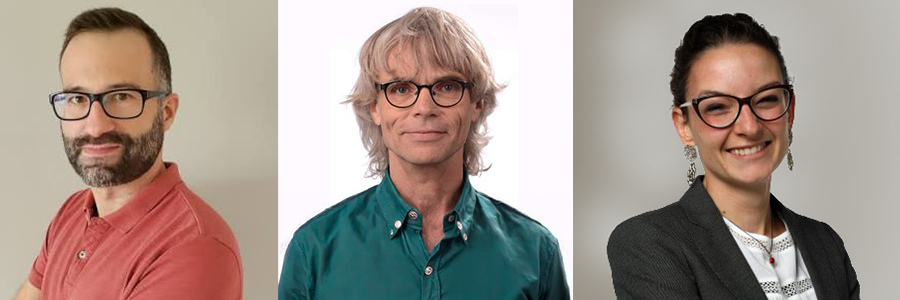
Dominic Royé, Yuri Engelhardt, and Anna Lombardi
Lombardi works at the intersection of climate science and public communication, translating scientific findings for journalists, policymakers, and general audiences. When she joined Copernicus nearly three years ago, she said, no formal climate data visualizer position existed within the organization.
Newsrooms have employed data visualization specialists for more than a decade, Lombardi noted, but similar roles remain relatively uncommon within scientific institutions. As climate datasets become larger and more complex, so does the need for people who understand both the science and how to communicate it visually.
“The goal is not to simplify the science until its complexity disappears, but to make that complexity accessible without distorting it.”
“You have tons and tons of data,” Lombardi said, including satellite observations, direct measurements, and the results of climate models. “The key thing is trying to get the message out of them.” Doing that well requires sustained collaboration with scientists. Visualizers must understand how the data were produced, what was and was not measured, what uncertainties remain, and which conclusions the evidence can support. The goal is not to simplify the science until its complexity disappears, but to make that complexity accessible without distorting it.
What They Will Explore
Visualising Climate 2026 is organized around three overlapping pillars: science, media, and art. Rather than treating scientists as the producers of information and designers or journalists as the people who package it later, the conference aims to bring those groups into conversation from the beginning.
“It’s really important to see art and science not as competitors but as collaborators to communicate the same message,” Lombardi said. “The scientists and the artists are equally important to the final goal of actually getting people to acknowledge the situation and do something about it. We must talk to the heart as well as to the brain.”
Accepted papers and presentations will examine topics including data comics, eye tracking, the psychology of visualization, satellite data, school atlases, behavioral responses to climate graphics, and collaboration between scientists and designers. Several projects examine physical and three-dimensional approaches to visualization, including objects and sculptures designed to communicate river health, environmental conditions, and the distribution of climate effects across urban spaces.
 The program also includes more than 30 talks and several 90-minute workshops. One workshop will examine how environmental data can be transformed into comics. Another, led by Gustavo Faleiros of InfoAmazonia, will focus on interactive visual reporting about environmental issues in the Amazon region. Other sessions will address how climate change is visualized in the Global South, methods for communicating uncertainty, and the challenge of distinguishing historical observations from projections of possible futures.
Those distinctions matter, Engelhardt said, because climate graphics often must communicate several types of information at once. A single visualization, for example, might show what has already happened, what scientists project may happen, and how those projections vary under different policy scenarios.
“The conversations in the hallways are going to be even more important than the talks.”
Building a Community
The organizers expect that some of the conference’s most important exchanges will take place outside the formal sessions. “The conversations in the hallways are going to be even more important than the talks,” Cairo said. The larger ambition is to build an enduring international community whose members continue to exchange ideas and collaborate after leaving Bologna.
Organizers are already planning the 2027 edition—the dates and location will be announced in November. They are also exploring ways to include more participants from the Global South. Travel costs and visa requirements can make international conferences inaccessible to researchers, journalists, and artists, including those from regions expected to experience some of the most severe effects of climate change.
Although the inaugural gathering will be held entirely in person to encourage community-building, future events could incorporate virtual talks or satellite events for those unable to travel.
As the organizers put the finishing touches on the conference, they reflect on how far the project has come. What began as Cairo’s suggestion in a social media post has revealed a sizable international community seeking a place to gather, along with a shared belief that climate communication must go beyond simply presenting the numbers.
The task is to show what those numbers mean. A chart should not simply show that the climate is changing. It should help people see the world that change is creating and understand what is at stake.
__________
Story by Lauren Comander