
Catch the Replay: Meet a Data Scientist Lecture by…
IDSC was pleased to welcome back our former Director of Programs, data scientist Athena Hadjixenofontos, PhD, to kick off the second year of the Meet a Data Scientist lecture series on Thursday, September 30, 2021 (4:00-5:00 PM) via Zoom. This lecture series is co-sponsored by the Miami Clinical and Translational Science Institute (CTSI) and is free and open to the public.
The Meet a Data Scientist Lecture Series is a chance to get up-close and personal with top-level experts in a wide variety of fields that use data science. The purpose of this series is to introduce you to the people behind the data, their lives, interests, career choices, their work, and their passion for how they use data to solve grand challenges in their respective fields.
The special type of data that Athena now works with is high dimensional data. In her talk entitled “Model Development with High-Dimensional Data,” Athena began with an obligatory disclaimer “All views and opinions expressed here are solely my own and do not reflect and opinions of my employer,” before jumping in for this deep dive into her fascinating career track that led her to being a data scientist.
Athena’s Journey
Athena was born and raised on the island of Cyprus, hence her geopolitical journey started there. Her dad is an engineer, Athena explained, so they were just a science family from the get-go, and that was really the seed of how she ended up in data science.
For university, Athena moved to the UK and thought she was going to study Marine Biology, but she ended up being really interested in Biochemistry and Genetics. Following that, she lived in Portugal for a year where she did research in Microbiology, so, she joked, she has a lot of wet-lab experience—much more than a data scientist needs. After Portugal, she moved back to the UK, where she worked in the cancer field for a while before coming to Miami.
It was during her PhD in Miami that Athena changed directions. Back at university in the UK, she had studied Biochemistry and Genetics and, she said, was lucky enough to graduate top of her class. Back then, she said, she was super into yeast genetics and got to work with Nobel laureate Paul Nurse who worked on the cell cycle. She thought she was set on a path of the classical Genetics, but then, she got to her PhD rotations. This, she explained, is where you try out different labs for a few months before committing to one of them for the next five years of the program. In her first rotation, Athena said she started feeling really bothered about how isolated her thinking was.
For every single one of her projects prior to that point, Athena was focused on one thing: one gene, one protein, one (at most) pathway, and that felt really limiting to her. She started wanting to see Biology from more of the whole-system perspective, and that, she shared, landed her in Genomics.
Genomics was the first -omics field back before all the other -omics became possible, Athena recalled. And in genomics, she joked, she found other things to bother her. So, how does one go from Genomics to Natural Language Processing (NLP) she asked?
Transitioning to Natural Language Processing (NLP)
Athena’s first NLP project, she shared, was at the previous incarnation of IDSC (IDSC is formerly “CCS” the Center for Computational Science), working with IDSC Director Nick Tsinoremas and, she complimented, some of the amazing people at the University of Miami. With her first NLP project, Athena discovered that NLP has a lot of the same methodological issues that Genomics does because of the high dimensionality of the data. NLP has a lot of different types of sub-fields and sub-tasks, so she was focused on the type of task that she was doing in Genomics as well: building predictive models and mostly classification-type tasks. That was the rationale for her transition—it felt natural to her. Also, she made the point, language data are complex, they’re messy, they’re ambiguous, there’s redundancy. Humans don’t speak in very clear terms. So, if you ask a biologist, biological systems also have those same characteristics.
When her first child was born, Athena shared, she, reluctantly, had to leave Miami so her family could live closer to her wife’s family in Phoenix (Arizona). And, she said, she even more reluctantly left IDSC and joined industry. She commented on the contrast between working in academia and working in industry. She said she is enjoying working in industry, but it’s definitely a very different focus, very fast-paced. Both jobs have a lot of the interdepartmental communications that can really make your work a lot easier, she observed, therefore most of the soft skills really translate: Learning to work in cross-functional teams and with people who don’t speak your language.

What is a Dimension?
In our context, Athena explained, it’s another name for a variable; it’s a column in your spreadsheet; it’s an attribute of an observation; it could be of any kind (such as discrete, ordinal, nominal, binary, continuous, etc.). And then, when you start using that variable as an input into a model, then you’re starting to think about it as a feature, and that may or may not be the original untransformed dimension, or it may be something that was derived from it, or some combination of dimensions into a single feature. Those two things are not always the same. In this slide, there are some “tiny toy” examples and some people attributes:
In general, Athena explained, there’s a huge, huge number of people attributes. If you think about the number of cells in your body and each of those expresses how many different genes at different times in development, the number of what is possible to collect can become really huge. Some of these things are going to be relevant and some of these things are not going to be relevant to what you care about, she expounded. So, if you do care about gene expression for a specific disease, that’s relevant information. If you care to see what may be more, sort of, psychology phenotypes or other things about people, then you’re going to be interested in a different subset of those possible variables.
One of the points, Athena said, that she wanted to make is how subjective it can be to decide what it is that you’re collecting data on. In the slide above, as an example, is Person A B or C’s favorite animal at age three that important? Is that predictable of anything? Maybe, Athena reflected.
If we think about the space of possibilities and seeing everything as data, then all that data is high dimensional, Athena went on, but you end up limiting what you actually collect information on, and that can end up limiting the dimensionality of your data set. That’s generally a function of availability of resources or, if you have some domain knowledge, that tells you what you want to focus on so that you can choose variables that are suited to the task at hand, she explained. This is, actually, she continued, one caveat in the era of big data because a lot of the automated collection generates gigantic data sets in terms of how many rows they have, but what you’re collecting data on is generally more limited. Even with big data in terms of rows, the data set isn’t necessarily then going to be collected with the objective of your task. So, there is always this awareness, Athena related, that you need to have about whether it is suitable for your task at hand, or, is the definition of the use not relevant here?
After mentioning some of the biases, Athena suggested we think of the elephant and the blind men trying to feel their way around. You’re going to bring that into your analysis, Athena said, guaranteed. So the best thing you can do is to be aware that you’re doing that, she advised, and try to find areas where that’s actually impacting what your output is.
The Curse of Dimensionality
How high dimensional is high dimensional? For those who work with structured data, thinking about 20 dimensions sounds like a lot, Athena said. It’s a lot when you’re thinking about visualizing it, but it’s not really in the range, in the order of magnitude to create some of the more serious issues. So, when we get to 10,000 variables, when we get to 88 million variables, it becomes it becomes a huge issue. How do you work with that, Athena asked?
In statistics you’ll see P and N, Athena explained. P is generally what we use to denote the number of parameters, so these are the number of variables you’re going to estimate these parameters for whatever it is that you’re building. And N is the number of observations. When P is much, much larger than N, a lot of your classic statistics assumptions start breaking down. Let’s see what that looks like, Athena expounded:
Why is it important right that you have such a small ratio of data points to parameters? There’s a number of reasons for this, and it’s collectively referred to as the “curse of dimensionality.” This expression is attributed to a computer scientist, Richard Feldman, who was working in dynamic programming, Athena revealed. But really, the heart of what we’re talking about here, she said, is that when you have this many dimensions, the data ends up being very sparse. All of your asymptotic theory, along with statistics, is no longer in your corner. Usually, we try to find similarities between data points, try to find some structure, something that can tell us something. Athena went on, When the number of dimensions is so large, there’s lots of differences between the data points, and it becomes more difficult to figure out which of them matters.
Think of it in 3D space where we can visualize this, Athena suggested. Say there is a tree behind you, and there’s the shadow of the tree falling in front of you. You might see a bunch of apples that, in the shadow of the tree look like they’re all together, but then, when you actually look at the real tree in 3D and go from the 2D shadow projection to the 3D, the apples end up being much farther apart, And we’re just going from 2D to 3D—go to 88 million dimensional space, Athena stated, the sparsity issue is a real problem.
What does that look like in real life, she asked? Start with the example of Genomic data. This plot is called the Manhattan plot. If you squint your eyes, you may see something that looks like skyscrapers, therefore the name.

Each dot on this plot is a position in the genome that varies between people. Nowadays, we usually call it “variant.” Variant is the catch-all name for those, and you have collected data on those. Athena continued: The objective here is to see whether any of these variants are associated with whatever disease you’re interested in. This is the design of a classic genome-wide-association analysis. The data collection happens by the genotyping machine, so you have all variants collected in the same experiment. Seen with the genome wide SHIP, back in the day, Athena said, you end up with a million variables for each of the people that you genotyped. If a typical data set from a single lab is a few thousand people, when you divide your N by your P—so, a thousand people and a million parameters—you end up with that ratio in the range of like 0.001, she summated, which is much, much less than the ten to five that is recommended for working with traditional statistical methods. This is why you see labs coming together as consortia, Athena observed. Everybody pools together all of their samples so that they can actually say something about this data.
Calling out something important here, Athena went on, although this is a high dimensional data set right from a sort of visualization perspective, the models that were usually built for these genome-wide studies are not actually considering all variables in the same model. First, filter out a bunch of them. For various reasons, maybe they’re missing too much data, or they’re correlated with each other. And then we take each of them separately, build its own model, so you end up—instead of one model with a million variables, which we’ve established is a bad thing to do—with a million models. The cost of this, Athena explained, is that you have to, then, account for the fact that when you run a million tests you’re going to, by chance, find something that looks important but actually isn’t, she explained, so you have to adjust your thresholds for accepting something as important, as a significant result.
What Natural Language Data looks like in NLP
Moving on, Athena visited what natural language look likes in her adoptive world of NLP. Natural language just means that it’s languages that are spoken by humans, so English, Greek, Spanish, Pashto, those are natural languages, she offered, and the data set here is a corpus. You have a collection of documents, they could be emails, or books, instant messages, or tweets, or legal contracts—any sort of collection of documents that you can imagine. And what is the dimensionality of that corpus, Athena asked?

Athena explained: Here, is a tiny little corpus made of two documents: Pandas are my favorite animal and my favorite dinosaur is mosasaurus. The way that we represent that in a form that the computer can understand is by building vectors that are the size of the vocabulary of the corpus. With her little toy corpus, Athena took the unique words and put them in this table. And for each document, say for document1, she now has “1”s in the places where the document has the specified word in it (column one), and “0”s in the places where it doesn’t. So, Athena ended up with these two seven dimensional vectors (two sets of 1s and 0s in brackets at right) that would be her input. It’s now encoded, she explained, in a form that the machine can do something with it.
This is called “one-hot encoding” and it’s actually not a super great way to represent it, Athena stated, but it’s really simple to explain. It’s not super great because it doesn’t preserve a lot of information, like the order of words in the document is lost. Or, maybe you have two words that are occur together, like New York. You would have a 1 for the word “New”, and a 1 for the word “York,” but that’s not really what that means.
You can build bigrams, like two-word pairs, and start increasing the dimensionality of it further by adding all combinations of two words at a time. There are more sophisticated encodings, and if we have time we can talk about them, Athena concluded. Next, we had a question from the audience:
Q: What about the data situation with columns? Can we still apply the tools that you’ve used for visualization? For example, how can we plot a scatter matrix? Also, for visualization and dimension reduction, do you rely on supervised techniques?
A: We’ll talk a little bit more about dimension reduction later, Athena answered. There are some supervised techniques that you can use too, and, actually, that’s a pretty hot area of research right now. There’s a lot of papers coming out right now for supervised dimensionality reduction, which is very cool. In terms of plotting, she explained, you’re definitely more limited. We’ll see a couple of examples in the exploratory data analysis part. That’s the next section, she advised, so hold on tight.

What I am trying to say with this slide, Athina explained, goes back to the question: What is your order of magnitude of dimensionality for natural language data? An upper bound with 170,000 words in the English language, that’s about as big as that would get if you take only single words, if you take only unigrams, and you don’t start combining words into separate variables, essentially.
This graph, Athena stated, shows the relationship between vocabulary size and the number of documents in the corpus. There is a prediction of how many words you’re going to end up with based just on how many documents you have. Explaining the chart, she said: The dashed line is the prediction based on Peek’s law, and the solid line is an empirical estimate based on a corpus from Reuters. This is represents newswire stories from ‘96 and ’97, and there’s about 800,000 documents in it. And for the first million or so tokens—tokens would be the individual words when you break up the sentence—for the first million of those in this Reuters corpus, the prediction is around 38,000 terms, and the actual number is just a few tens of terms off. Typically, Athena revealed, you might end up with a vocabulary of 10,000 words.
Purpose of EDA (Exploratory Data Analysis)

Now, a look at how you visualize this stuff, Athena continued: Just a couple words on the purpose of EDA, why do you even want to visualize it and get to exploring it? It is not just visualization—you might even build an actual model to explore, we’ll see some of that later, she added—but a lot of it is visualization. You want to do it to identify if there are subsets of the data that you can’t trust. Did something go wrong, last Tuesday, when we were genotyping batch five, and most of that data is looking ‘clunky’? You do get a sense of that, of what you can trust and what you cannot trust, she explained. You also get a sense of the overall structure in the data, and, by structure, Athena clarified, it just means are the characteristics of the data that you’re examining sort of distributed randomly, or is there some structure to them? So, if all of last Tuesday’s batch was bad, there’s some structure in the missingness of that data set, she declared, and that’s important.
You also build intuition, Athena continued, on modeling decisions. It is really important to understand that you can build a model that is terrible and just misleads you. The fact that it produces an output doesn’t make it reliable, doesn’t make it an output you can count on. So how do you know that you can actually rely on what you’ve built, she asked? Much of that will end up building on the intuition you’ve gained from doing EDA.
Summary Plots

Summary plots you can still do, Athena offered. Your usual univariate and bivariate descriptive statistics are good, except, they’re not for your individual variable. They might be for some aggregate measure. Maybe you have a mean, and you plot the distribution of those means. Each data point that goes into planning this summary plot has its own other distribution underneath it, and you’re just looking at this, one aspect of that distribution. So, of course, it’s not giving you the full extent of the information that you may be used to getting from that, Athena affirmed.
Circos Plots

Then, Athena continued, there’s also “circus” plots. She’s a big fan of these, she said. She thinks they’re really great because they give you more of a big picture view. These are very common in biomedicine, she remarked, but of course they can be used to visualize any other data.
In the circus plot pictured above, it shows migration flows. Each color on the outer track is a continent or a sub-continent
- East Asia-turquoise
- Southeast Asia-dark green
- Oceania-teal
- Latin America-mustard yellow
- North America-red
- Africa-orange
- Europe-green
- Former Soviet Union-purple
- West Asia-magenta, and
- South Asia-royal blue),
and the form to information is shown by the distance of the bands that go across the circle from the outer track. Immediately, she observed, from Latin America to Europe is this big yellow line. Immediately, she illustrated, you can see that the largest volumes are:
- from Latin America to North America (wide mustard-yellow connector)
- from South Asia to West Asia (wide arched royal blue connector).
And in the same plot, she remarked, you get to see that Europe seems to be receiving the most diversity with lots of little different colored bands (turquoise, dark green, teal, red, orange, purple, royal blue, and magenta), coming in from every other place. But people within Europe tend to migrate to other European countries, rather than outside of Europe. As you can see, the widest arc of green goes Europe to Europe, but it’s receiving a lot of these other colors.
It’s a lot of information that you can encode in a single graphic, Athena described. It’s really rich in information, and this one is even a simple one. With more complex data sets, Athena revealed, she’s seen ones that have three or four, and even more tracks, and each of those has information on a bunch of variables. So, she concluded, just huge amounts of information that you can encode in these.
Exploratory Data Analysis | Dimensionality Reduction

Okay, Athena continued, let’s talk about dimensionality reduction. It’s one way to turn your problem from a large P/small N one into a smaller P, and is N large now, or not really? You’re not actually changing the number of observations you have, but it does change the ratio of N and P. This sounds great, right, Athena asked? Except that the lower dimensions with these methods are generally sort of ‘squishing’ a number of the original variables together according to how the algorithm decides to do that. And for some methods, it’s a linear combination of the original variables, and for others it’s not. And the issue with doing that is that it reduces interpretability.
If you were to feed these lower dimensions, these combinations, into a model and say: Hey model, how important is this lower dimension1—that doesn’t even have an actual name—in discriminating between people with Multiple Sclerosis and those without? You’ll end up with an answer, but can you use that? What does that mean?
We’ll see how, with Genomics, you do end up with dimensions that capture ancestry, Athena offered. So, it’s something that’s meaningful, that’s interoperable, and that we do use, but that’s not going to be the case in every type of data set. And there’s also just a quick note, Athena added, on supervised dimensionality reduction: These methods try to direct the lower dimensions towards those that capture information relevant to the supervision target. If your supervision target is the person that has multiple sclerosis or doesn’t have Multiple Sclerosis, that’s your supervision target, the lower dimensions that you are asking the method to capture are ones that contain more of that information.
There’s a lot of METHODS that you can choose from:
- PCA (principal component analysis) is the most common one, that everybody will have heard of.
- NMF (non-negative matrix factorization) is a little bit less commonly used but can be useful.
- t-SNEs (stochastic neighbor remedies) are really, really useful actually and very common in biomedical applications nowadays.
- U-Map
You can get all kinds of lower-dimensional spaces by feeding the data through a neural network, and we’ll see a couple of those applications in NLP, Athena explained. There are differences between these, and the dimensions that you’ll end up with, will end up having more, or less, separation between distinct subgroups within your data set. Especially with t-SNE and U-Map you usually see a lot more distinct clusters than you do with, say, PCA.
Principal Components Analysis

Athena began: Let’s try to build some intuition about PCA, since it’s one of the most common ones.
We’re not going to go into eigenvectors and eigenvalues, and we’re not doing any decomposition of a covariance matrix, we’re just looking at this dinosaur and trying to build some intuition around it.
What I want to do here, Athena explained, is capture the most information I can about this dinosaur in lower dimensions. The PC algorithm will start rotating this dinosaur, and it will find the view, where, if you take a picture of this 3D dinosaur you capture the most information that you can capture about it. Taking a picture is our equivalent of going from 3D to 2D, so we’re reducing in dimensions. And the most information is the variance that we’re capturing made with each of the views, and that’s shown in this blue dashed line. You want this blue dashed line to be as long as you can make it.
Imagine, Athena suggested, if you look at the dinosaur from the underside, you’ll just see like some feet, maybe a little head peeking out, but you don’t get a lot of information. You don’t know how tall it is, you don’t know how big the tail is, maybe, you don’t know if it has spikes onits back—all these things. So, let’s start rotating the dinosaur.

Yay! Now we’ve found a view, Athena declared, that maximizes the variants that we can capture. This blue dashed line is much, much longer, and this becomes our first principal component. So, we have PC1. And now we fix this axis, and we start rotating the dinosaur around axis to find the next most informative axis. Now we want to make the purple line as long as we can.
We rotate the dinosaur around and tah-dah! You have a view, Athena revealed, that captures as much information as you can in just 2D about this dinosaur. Here we see it captures the height, it captures the length, and this may also be variables in your dinosaur biometrics data set, so maybe you can check what variables are, sort of, correlated with these. But we’ve lost information. We don’t know how wide the dinosaur is, we don’t know about spikes, necessarily, and some information is going to get left behind. That’s just some intuition, and here’s an example that’s not about dinosaurs . . .
Genomic Data

This is a plot of the first two principal components with data from the 1000 Genomes Project. The 1000 Genomes Project did whole-genome sequencing of about 2,500 people from 26 populations around the world. Colors are based on metadata, so self-reported race and ethnicity of those individuals. Each dot is a person. The positions on the plot are based on the genomic data, and then running PCA on that genomic data. The first principal component doesn’t really separate Asian from European from African, so that ancestry is separated with the first principal component, but the second principal component, as you start moving on the PC2 axis starts separating Europeans out of that group, and so on.
It’s fairly center practice in Genetic Epidemiology, to use the first few principal components as covariants in a model that you build. This way, you control for ancestry. You don’t really super care about the interpretation of those principal components. Those are not the coefficients that you care about the most. You’re just trying to use them to control for the main effect that you’re trying to estimate.
Dimensionality Reduction in the Domain of Natural Language

Let’s switch gears, Athena said, and talk about dimensionality reduction in the domain of natural language. This is a paper from Tomáš Mikolov and his group at Google. This was a paradigm-shifting paper published in 2013. It introduced what is now known as the Word2Vec model, Word2Vec embeddings, you may have heard that term? She asked. Don’t worry if you haven’t, maybe it’s very NLP specific, Athena offered.
They introduced a specific type of neural network. They call it the Skip-gram model, and it takes the corpus that has, say, a vocabulary of 10,000 words and, in this case, they output just 1,000 dimensional vectors. So, we went from a vocabulary of 10,000 to 1,000. It’s not quite as simple as that, because the Skip-gram model considers some of the neighboring information, so our starting dimensions is not the 10,000 that I’m simplifying it to, but I think it makes the point.
Let’s now take those thousand dimensional vectors, so it’s just a line of numbers that’s 1,000 numbers long, and then run PCA on that, Athena suggested. And then we plot, the first two principal components, just like we did before. So, this slide is the plot of the first two principal components on those 1,000 dimensional vectors. Honestly, this like feels like magic, she remarked, but it’s math. In the 2D projection, you see that the model learned relationships between the concepts. So, the capital of China is Beijing, the capital-of Russia is Moscow, and the model has organized these concepts in a way that their relationships to each other are true to how a human might organize them—country with a capital “C”.
The amazing thing is that they didn’t tell the model, Athena explains, there was no supervision information. They didn’t tell the model countries and their capital cities look like this. The model just discovered this by itself just by how it is constructed. And, just to add to just how amazing this is, you can also do some vector arithmetic here and get results that makes sense. Take the France vector subtract the Paris vector, and add the Tokyo one, and France minus Paris plus Tokyo gives you Japan. And this works out. If you want to look at the vectors and do it with the parallelogram, you can see that it works out, she suggested.
There is an issue here, Athena revealed. Take a few more examples of this that are not so sort of vanilla-like-countries-and-their-capitals, and you start seeing how our biases end up encoded in the language that the models are trained on. In the lower dimensional space, you may also find the relationship man is to computer programmer as woman is to homemaker. All these biases end up represented, because all that this is doing is taking words that humans wrote and building a model out from them. Debiasing the word embeddings is a very active area of research, so there’s a lot of work going on to try and remove that bias. And there are also those who don’t think that that’s possible, but that’s a separate conversation.
As EDA (Exploratory Data Analysis)?

That work vector stuff is cool, but how does it help you with EDA? Let’s look at a corpus of clinical case reports. The authors here trained 300 dimensional Word2Vec models so they have those. They then run t-SNE models to reduce the dimensionality further and get a 2D plot.
Looking at the slide, above, Athena explained, each of the colors is a different organ or different system. The heart cluster is purple, and you see it is closest to the lung cluster. Does that mean anything, Athena asked? That’s where it becomes EDA, so you start making these observations about where things end up, and you try not to read too much into it, but also generate some hypotheses that you can test. That will give you a better idea of what’s going on with this clinical case report data. Why is the heart cluster closest to the lung one? Are there concepts or words that are in common, between those two types of case reports? What are those? What might those be? That’s where it becomes EDA.
Modeling
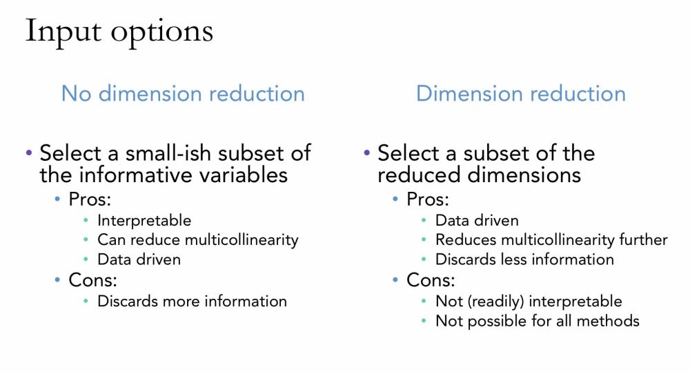
Now we have to make some decisions, Athena continued. We’ve built some intuition, and now we have to make decisions about what to feed to our actual model. Let’s assume that we have, for simplicity, just a classification task that we’re working on. We want to get to a situation where we can get reliable estimates of the effects of each of these variables, so we want to thin out the number of dimensions. You can take a subset of them. Or you can use their reduced dimensions as inputs. Here are some pros and cons listed on this slide for one versus the other. The main one is interpretability and this one is important enough to basically make many of the other reasons not matter in practice, because if you need interpretability, you’re constrained by that. Some methods are just not going to be very good for creating your inputs if that’s your requirement.
Looking again at the slide, Athena expounded. I also have the word “multicollinearity” on here, which I haven’t defined, and it’s just a problem in regression modeling where you have correlated variables in the models and their effects end up diluting each other. So, to make to make it super silly, say you have height measured in inches or height measured in meters and that’s like 100% correlated. It’s the exact same information, but you have both of those in the model, that creates a problem because they’re not adding information relative to each other.

Let’s look at that first left column from the previous slide, Athena directed. What are some feature selection methods? There are some papers that have more comprehensive reviews than what I have on the screen here. But in practice, commonly, what you would use would be a bunch of filters. We’ve already talked about dropping variables based on there’s too much missing data for them, so let those go. And dropping variables because they’re too highly correlated with others; you also drop those. Those are examples of a couple of filters, you can apply and that’s easy pickings.
With regression models, specifically, there’s also stepwise selection approaches, but they have some caveats that make them better suited as exploratory techniques, but they’re worth a mention. And, of course, there are a number of ways to do what we call regularization. And these are ways to reduce model complexity. The L1 penalty for regression, also called LASSO aggression, shrinks the coefficient estimates, and some of them can end up being zero. And if the coefficient ends up being zero, then you can drop that variable from the model.
So, you might have a solution design where you, first, have a data set with 10,000 variables. You may build a LASSO regression that’s going to drop, say, 8,000 from that data set; it has shrunk those coefficients to zero. And then, with that limited data set, you’re now longer restricted to regression models, you can take those variables and then do your subsequent modeling with another algorithm. You’re not restricted to one. You can use it as just a way to select variables.
For other types of models, Athena suggested, like xgboosts, you can also tune pseudo-regularization parameters, so we don’t really have time to go into boosted trees, but there is like the depth of the tree and gamma—there’s a number of parameters that you can tune to effectively regularize that model. And, she mentioned, she already talked about combining those models.
Support Vector Machines (SVMs)

I wanted to give an example of a specific algorithm that is less sensitive to high dimensionality than most of the others, and that’s support vector machines. This was developed by Cortes and Vapnik from Bell Labs a long time ago in relative terms.
The idea here is that you’re trying to distinguish between the “X”s and the circles “O” by finding a hyperplane that gives you the maximum separation between these two types of data points. So, the largest difference between the Xs and the circles defines a hyperplane that you use to then make decisions on.
So, Athena explained, the data points, the observations that lie closest to the hyperplane end up being the ones that influence it. You see, she illustrated, I remove this this X right here (circling the lower of the two Xs in a grey box), but then this X (pointed to the plain X just above to the right) becomes the closest one, then my hyperplane might shift. Those we call the support vectors they’re the important ones for that classification, and because the rest of the data points they don’t matter so much, it’s automatically regularized. So, you don’t have regularization parameters or pseudo regularization parameters for SVMs because picking the widest separation margin automatically regularizes the model. This has been shown that SVMs do indeed behave exactly like other machine learning algorithms that use more specific types of regularization.
Did it work?

In closing, Athena asked: How do you know if you handled the high dimensionality of your data appropriately? How do you know you did a good job? There’s a number of diagnostic measures you can check, she added, pointing to the listings on the slide. Athena is also a huge fan of SHAP, a new newish package for explainability based on game theoretic principles for calculating the effects of various features and attributing feature retribution.
But really, ultimately ,what you want to do, Athena stated, is check that your model generalizes two data sets other than what it was trained on. You want to test it out-of-sample data and see if it is doing well. That’s really the ultimate test, she concluded. What we’re talking about here is largely overfitting and avoiding building an overfit model.
There was a final question:
Q: Are there any powerful unsupervised techniques for feature selection?
A: Usually, when you say unsupervised techniques, most of those will end up suffering from the dimensionality too. Think of K-nearest neighbor you end up with a lot of problems there just because of how you calculate those distances in such a high dimensional space in a way that makes sense. It’s not how I would do it. If you know something I don’t, let me know.
IDSC Founding Director Nick Tsinoremas wrapped up with a goodbye. Thank you, Athena, for the great presentation, and thank you all for coming today and we’re looking forward to seeing you at our next Meet A Data Scientist lecture.
