
The second year of our Data Citizens: A Distinguished Lecture Series—described as lectures by “relevant, important, and influential people in the fields of data science, computing, data visualization, and other related areas” by host School of Communication Professor Alberto Cairo, PhD (also IDSC Visualization Program Director and Knight Chair in Visual Journalism)—kicked off with a lecture by Santiago Ortiz, Founder at DrumWave.com, on Thursday, September 23, 2021 (4:00-5:00 PM) via Zoom.
Introduction and Background
Introduced warmly by his friend Alberto, Santiago was described as an “interactive designer, an information visualization researcher, an inventor, and an entrepreneur.” Dr. Cairo remarked that Santiago “has worn many hats throughout the years,” and that Santiago “likes to use his background in mathematics and complexity sciences to push the boundaries in information visualization and data-based storytelling.”
Dr. Cairo continued, “Santiago was born in Colombia, where he began creating images out of code when he was just 8, which is quite impressive, I must say. In 1999, he co-founded Moebio.com, an innovative, interactive data studio. He moved to Madrid, Spain, in 2001, and worked as a consultant in interactive development, teaching art and interactive design at several universities, and working as an interactive artist, collaborating in several exhibitions in the country. And then, in 2005, he co-founded Bestiario.org in Barcelona, the first company in Europe devoted to information visualization. In 2012, he started working as an international consultant, helping organizations analyze data and develop information communication strategies—particularly in the United States. And then, in 2016, he co-founded DrumWave.com in California. And since 2021, he’s back in Spain, living in Dénia, a wonderful place. As an artist, and as a researcher in the areas of interaction design and information visualization, Santiago’s work has been exhibited in multiple cities in North America, South America, and Europe.”
TALK TITLE: Humans and Data | Exploring the rich and complex relationships between humans and data: How machines and humans differ when it comes to data and information, what dimensions of humans’ life are being captured in datasets, and how data and data visualization are means of communication, expression, and creativity.
Santiago began his lecture with a fascinating example of a memorization methodology (“Palace of Memory”). This technique teaches one to connect numbers with easily remembered associations so they can be used in combination to recall larger and larger numbers (up to 30 numbers in a row) by recalling their assigned visual cues. In this way, it served to illustrate that, while machines use numbers to memorize stories, humans use stories to memorize numbers.
Concept of Data vs. Information vs. Meaning
Using Lichen (a tool/environment created at DrumWave), Santiago downloaded 2 random Data samples from a table of 5,000 nutrients and examined them to see if there were any/how many repeated values. Switching to a “Variable Viewer” of the information (versus the Data) visualized by color bars, the results revealed the structural similarities or pattern in the samples, even if the Data points are almost all different. This drove home the point that even if the Data is different the Information is essentially the same. So, Data is different from Information.
The difference between Information and Meaning, Santiago explained, was stated by Claude Shannon when he created “Information Theory. “ Shannon said it is possible to study signals without caring about the meaning carried by those signals—That was the birth of the Theory of Information. Santiago continued: It’s very interesting that machines can deal with Data and Information but, cannot deal with Meaning. Whereas, humans, on the other hand, care a lot about Meaning, and a little bit less about Information and the Data itself. It’s very important to understand that axis. It helps a lot to understand these differences between humans and machines when dealing with Data.
How Machines “Think” About Data
Next, Santiago shared an article that began with a photo of hot air balloons spread out in the sky. The article “Content-Aware Image Resizing in Javascript” (based on the Seam-Carving algorithm) explains how the algorithm starts from the bottom of the image and uses the “lowest energy” path to the top, always choosing the least amount of pixels to remove the background without removing any of the hot-air balloons, thus condensing the image and yet not distorting the subject (the background will be affected). Here, Santiago demonstrated, the subject (the hot-air balloons) seems akin to machines understanding the “meaning,” but the algorithm could care less about content and is just focused on color and pixels. He concluded: This serves to illustrate how machines think “locally” whereas humans try to think of the “whole.” For humans, the whole is easier to work with, and for machines, it’s easier to work with the parts.

How Humans Are Surrounded by Data | Human Dimensions
At Santiago’s company DrumWave, they are doing constant research on the different ways that people interact with Data. Showing a diagram that begins with Human Dimensions” at the center (the ‘important’ things in life, such as food, knowledge and studying, transport, sport, entertainment, family, relationships, etc.), Santiago said they are building an app that connects with those different dimensions (expanded boxes surrounding the center human dimensions show various ways human interact with Data, such as social media). Then next level (green) is the resulting databases that those systems create. Santiago made the point that while this representation shows a lot of what is out there, there is a lot more because it’s growing all the time. The ways in which all these data sets connect with human life shows that for any Human Dimensions that humans do in life there are already a lot of data sets being capitalized on by companies taking advantage of having all these human dimensions covered by data gathering apps.
“We are Surrounded by Data! (or: Spontaneous Information Visualization)
Santiago has been collecting images that somehow point to that data reality that surround humans. It also shows how humans cannot differentiate between the reality and the maps of the reality, and includes examples of data visualization that was not created but is spontaneous.
Examples included:
- A stack of weights at the gym with the area worn by use going from narrow at the bottom to wide in the middle to narrow at the top—a natural bell curve of use, revealing that 60 lbs. is the most-used setting, and textbook “normal distribution”
- A squash player in front of a wall that is marked by spots where the ball hits
- A well-used cutting board with the humorous caption “Data visualization of where I cut stuff.”
- Workers harvesting orange flowers from green rows appear as literal progress bars in an aerial photo
- A ‘bar graph’ created by the amount of sugar in products (collected in clear bags) from least to most sweetened
- An aerial photo of a parking lot with one entrance and the resulting tire marks in the snow creates a pattern of use by ingress and egress (and possibly, regress).
- The pattern of a carpet-cleaning robot’s path
- And a pie chart joke . . . (“Pie I have eaten. Pie I have not eaten.”)
Data UX
If we understand how humans interact with data, how they think of data, Santiago says, when you do user interaction (UX), when you think of the experience of the users in systems that contains data, it’s its own science. It’s different than when humans interact with regular apps in which there are actions, and tools ,and stuff like that. Here, you have to think about special things that humans can do with data.
One project that goes deeper into those capabilities (created by Santiago) is a program that exemplifies Data UX in how humans think. Santiago opened a tool with a graph showing Taxes Paid on the vertical axis and Earnings Before Tax on the horizontal access for the performance over time (2010-2013) of Fortune 500 Companies. Lines revealed if they are losing money in red, or making profit in blue. For example, selecting Apple, the resulting line showed a blue downturn from 2010-2011, then purple (mix) line rising to 2012, and then red to 2013. So, in perspective of Earnings Before Tax and Tax Paid, Apple had approximately $20,000M(20B)? Earnings Before Tax and 24% Tax Paid at the start, and went to approximately $90,000M(90B)? with the Tax Paid at 28%.

Selecting multiple companies, the resulting image is more about comparing patterns than values.

In order to do that (compare companies that had similar patterns), he is able to choose the pattern and then view the results, showing who’s ‘in the same boat’, so to speak, as Apple. This might reveal a trend in the similarity of ‘story’, which might mean they have similarities in financial strategies.

The system also allows him to suggest (draw) a pattern he’s interested in and see the results of which companies this ‘trend’ has happened to. It’s being able to do these kinds of interactions/analyses that is UX to him. This ability to interact allows users to get closer to the data, rather than it just being presented to them in some static visualization. For example, the user could input a line that queries which companies earn more and more but pay less taxes and view the results:

Or the opposite, etc. For him, this is just the beginning of humans “becoming analysts through interactions, not algorithms.”
Data is Language
“Data and everything related with data is part of human reality.” Now, we are starting to use it as a way to express ourselves. Santiago believes that data will become a new cultural industry, but, he says, it’s taking time and requires that many things happen. Data, Santiago says, could become a human language.
Necessary properties of language are that it’s productive, generative, and combinatorial. To illuminate this, Santiago shared an exercise he gives when he teaches. He gives students 2 numbers (like 75 and 37) and asks them to show in how many different ways they can be visualized. From a little representation of 75 squares next to 37 squares, examples included lines, bars, stacks, pies, circles, the size of objects, tones, colors, proportions, coordinates, densities, surface area, etc. Or, in dynamic ways, frequencies, rotations, etc. This, as a particularity of language, shows the diversity expression.
When Santiago was researching whether data could indeed be seen as a language, at some point he wondered if everything could be visualized and could be converted into a data visualization project, or whether there were some limits there. So, he looked at “the important things” in life. He asked for suggestions and made a list of the most important things in life (it ended up being 32 things, such as universe, colors, music, art, planets, stars, economy, religion, humor, sex, evolution, names, food, death, life, movies, family, trade, opinion, etc.). For each of those, they tried to find a data visualization project. In many cases he found several, saying said it was not difficult at all to find them, and sharing this interaction he made where you hover over the word and it shows you the sample (clickable) project he gathered (none he says were his Life, the Universe and Everything: a journey to information visualization).

This data exploration experiment led him to conclude that data and its dispensation can cover everything we want to say about reality.
On Universality
It can be thought that data and data visualization is just for adults and technically minded people, and it’s not for everyone. He wanted to explore this idea as well, so he gathered some examples to counter this idea.
The first example was a drawing by a 10-year-old boy who was plotting his interest in Avengers characters over the course of his reading comic books (comic book titles are on the vertical axis and the scale of interesting is on the horizontal axis). Then each hero (Hulk, Hawkeye, Iron Man, etc.) has a different color and reveals he is least interested in The Hulk and most interested in Capt. America by their ending position, although they started out tied.
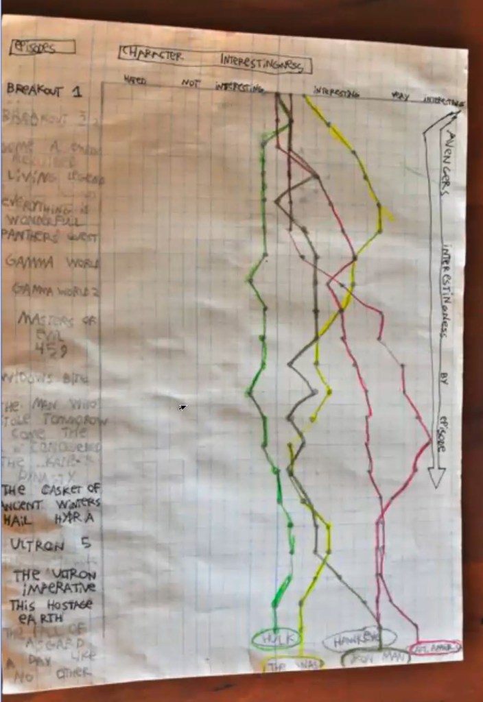
This was, Santiago commented, from a boy who had never seen a data visualization very avant garde and advanced as a concept, because it was not just objective data such as character occurrences that’s he choosing to plot (the kind of stuff that we do a lot), he was plotting his own interests so it was subjective data visualization, which, Santiago believes, we will see more of in the future.
Another example shown was from a workshop Santiago did with his children to see what algorithms they would invent to classify data points. The children have to choose a color to color in a white dot surrounded by other colors in varying proximities. The factor Santiago is interested in is what the criteria is for which color they have chosen. For example: looking at ‘neighbors’ and counting.

This raised questions (with kids and other users) about how much you really need to learn mathematics or statistics for natural data science because many of the most-used machine learning algorithms are quite intuitive—it’s something that humans already use a lot, it’s very natural. This shows how data and many of the more modern data algorithms, machine learning, etc. are pretty universal and intuitive. This serves to illustrate that data is part of the human sphere already, not something from the outside.
Tell Stories
Speaking of stories, Santiago revisited a project “Lostaglic” that he created from a “Lost” wiki (the TV show) called “Lostpedia”. Santiago used the provided scripts and images of all the characters and reconstructed the whole story, episode by episode. The scenes presented in a linear series of character photos (in speaking order) and the dialogue appears as you hover so you can read it like a comic book. In talking about Data UX, Santiago says one of the great things about Data UX is that it gives the user different ways to view the data. Beyond the first, liner episodic version of the data, there is a 3D graph that Santiago created to look at various other aspects, such as the relationship between characters (how many episodes they had in common, for example). This interactive interface enables you to see the data in terms of frequency, concurrences, etc., and possibly, find patterns in the story. You can experiment with varied visual representations of the same data, employing multiple techniques: index, matrix, reenactment. Santiago says “This is Data UX for me. It’s allowing the human to move around the data, to look at it from different perspectives—in time, in structure.” Returning to a visually linear representation as a reenactment, Santiago cycled through the dialog accelerating the speed and making the point that the data is rebuilding the TV show in a way, retelling the story. This is also a form of language because it allows you to express the story in many different ways.
Communicates and Expands Knowledge
Focusing on knowledge, Santiago says, language is very important as a tool, sharing models about the world. One such model is a client project focused on knowledge for the Ross Institute, depicting the history of humankind in parallel with childhood development. A complex, spiral pattern with connective threads, this multi-faceted project is an interactive representation of information. (See the project at spiral.ross.org/spiral/#/.) It’s is a great example of using data in a visualization to explore knowledge.

We are Surrounded by Data! Part II
In closing, Santiago returned to real-life examples of data visualization, including . . .
- A worn keyboard revealing the frequency of letters in your writing (and probably in your language)
- A worn door with the protective plate, obviously, in the wrong place
- A set of books, The Decline & Fall of the Roman Empire” with a decaying column that gets worse from volume I to volume VII
- A series making the invisible visible included an image of a magnet on top of compasses, a transcription of music in a text message, the vortex of airplane exhaust revealed by red powder, a flame as a heat map
- The Cortical Homunculus (on brain capabilities)
The session ended with a Q&A. Santiago closed with this . . . “Information has the potential to replace the technology of money.”
Humans and Data | references
mentioned in the lecture:
- Santiago Ortiz work: moebio.com
- Moonwalking with Einstein book: https://www.goodreads.com/book/show/6346975-moonwalking-with-einstein
- Content Aware image resizing: https://trekhleb.dev/blog/2021/content-aware-image-resizing-in-javascript/
- about Information Theory and Claude Shannon: https://www.quantamagazine.org/how-claude-shannons-information-theory-invented-the-future-20201222/
- Life, the Universe and Everything http://moebio.com/research/lifeuniverse/
- Lost Project: http://intuitionanalytics.com/other/lostalgic/
- Spiral project: https://spiral.ross.org/spiral/
other interesting and related references:
- Compilation of physical visualizations; http://dataphys.org/list/
- Models are real, Olafur Eliasson: http://th3.fr/imagesThemes/docs/2._ELIASSON.pdf
- Silent Augmented Reality, Dominikus Baur: https://do.minik.us/blog/silent-augmented-reality0
Original Story: https://idsc.miami.edu/data-citizens-santiago-ortiz/


