
“This Hurricane Map Doesn’t Mean What You Think It Means: We use hurricane forecasts to warn people. Why do we misinterpret them so often?” is a motion graphic created by CCS Visualization Program Director Alberto Cairo, along with Tala Schlossberg (NY Times Opinion Visuals Journalist), (“cone of uncertainty”) which appeared online at The New York Times. The graphic explains how to interpet the typical ‘cone’ map, and what the “cone of uncertainty” means. Click on title above or here.
About Dr. Cairo
 Alberto Cairo, PhD, a Spanish information designer and professor is the Knight Chair in Visual Journalism at the University of Miami School of Communication, and the Program Director for CCS’ Visualization focus area. Dr. Cairo holds a BA in Journalism (from the University of Santiago de Compostela) and an MA and PhD from the Universitat Oberta de Catalunya (in Barcelona). He worked as a data journalist and information designer at El Mundo, Spain’s second largest printed daily newspaper, and he was the director for Infographics and Multimedia at Editora Globo in Brazil.

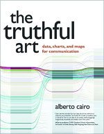
 The author of The Functional Art: an Introduction to Information Graphics and Visualization (2012), and The Truthful Art: Data, Charts, and Maps for Communication (2016), Dr. Cairo’s latest books is How Charts Lie: Getting Smarter About Visual Information (2019).
Find out more at albertocairo.com.


